
Facebook’s Global Partner Centers
Interactive Exhibits that Explain Data

From the moment media partners, c-suite execs, policy makers or employees enter one of Meta’s global HQ campuses, they are greeted with uniquely interactive exhibits that tell the story of Meta, its mission, and its products. We introduce them to the capabilities of the Meta family of apps and services through a series highly interactive exhibit spaces through a concept of “The Digital Forest.” It’s all about how it connects or “roots” you to the rest of the world, and how you connect to it. Essentially they are each complex data and product stories with the goal of making it easier to understand, fun to learn about, and to encourage educated partnerships with Meta.
THE PROBLEM
Create a timeless set of exhibits that demonstrate META’s capabilities in a fun, and inviting way that’s also flexible enough to update as fast as the company does, translate regionally, work with various floor plans, and tell the story of the company, it’s thousands of products, without showing thousands of products.
THE BRIEF
Express the culture values of Meta while meeting the needs of our target audience (C-Suite, media partners, policy makers, and employees). It must be flexible in nature both on the back-end and in physical space. People should leave feeling both impressed and committed to partnering with Facebook. “Build valuable relationships” and show how good data can be simple.
MY FOCUS
Keep the UI on brand, the UX must feel intuitive to someone who has never seen Facebook, and partner closely with lead data and product keepers that sit next to META’s C-Suite keeping them informed of every piece. Gather necessary assets and develop new patterns exclusively for the exhibits that directly link back to the parent product. Lastly, figure out how all the products connect in one narrative.
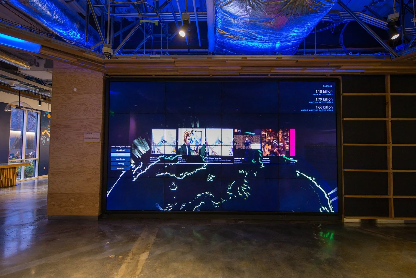
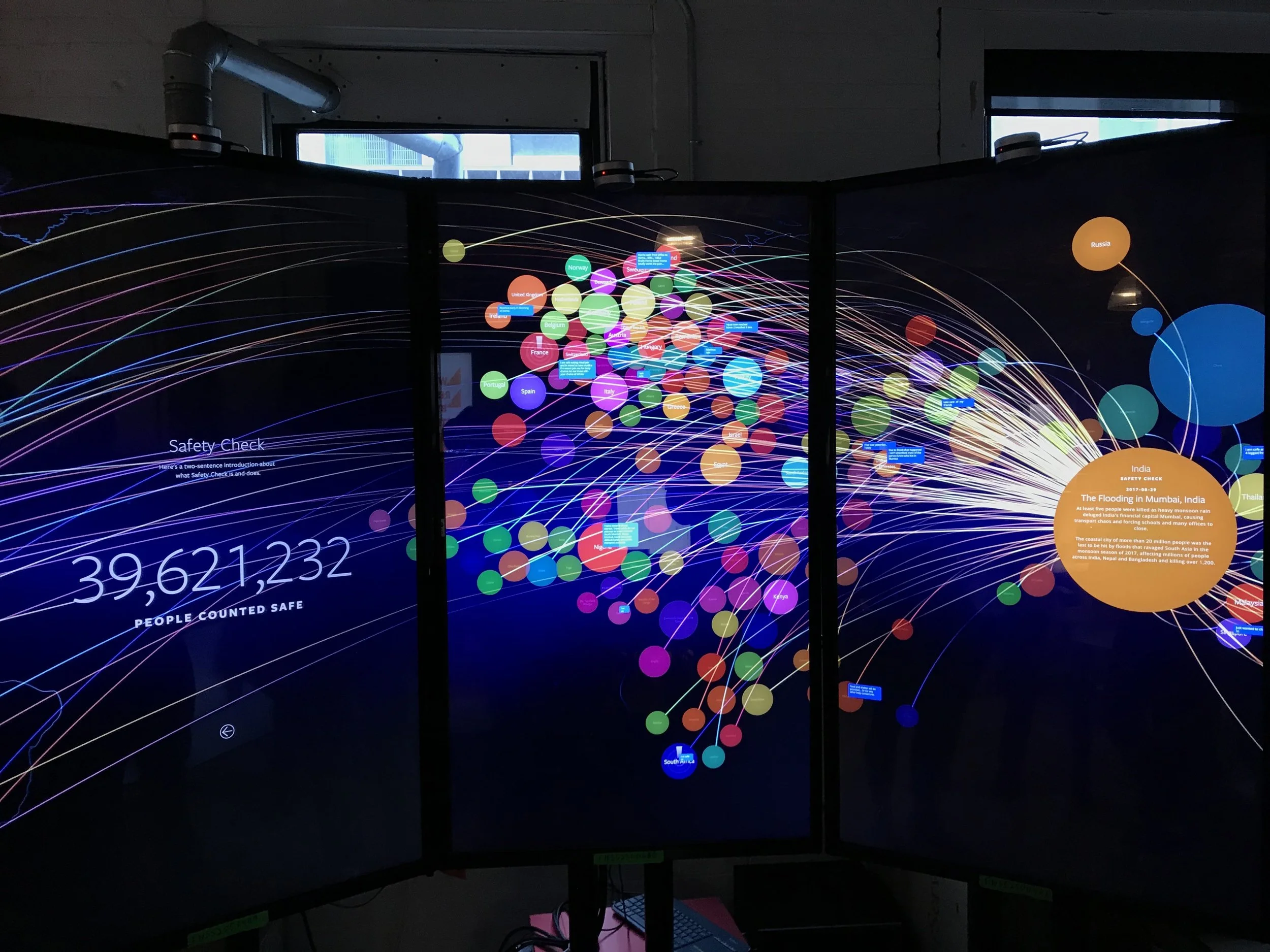
PREVIOUS PARTNER CENTER
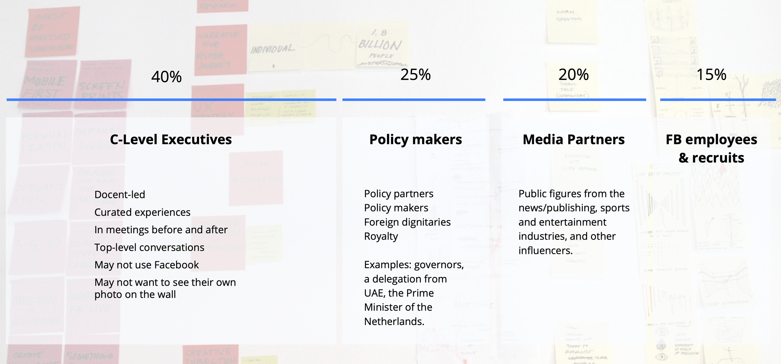
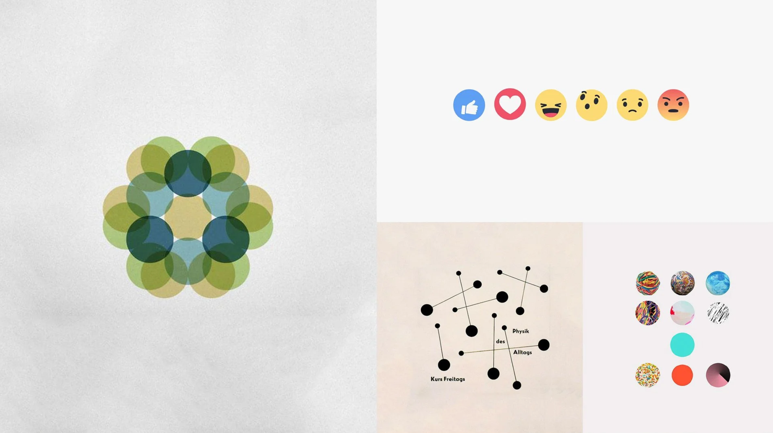
CORE AUDIENCE BREAKDOWN
THINKING and BUILDS
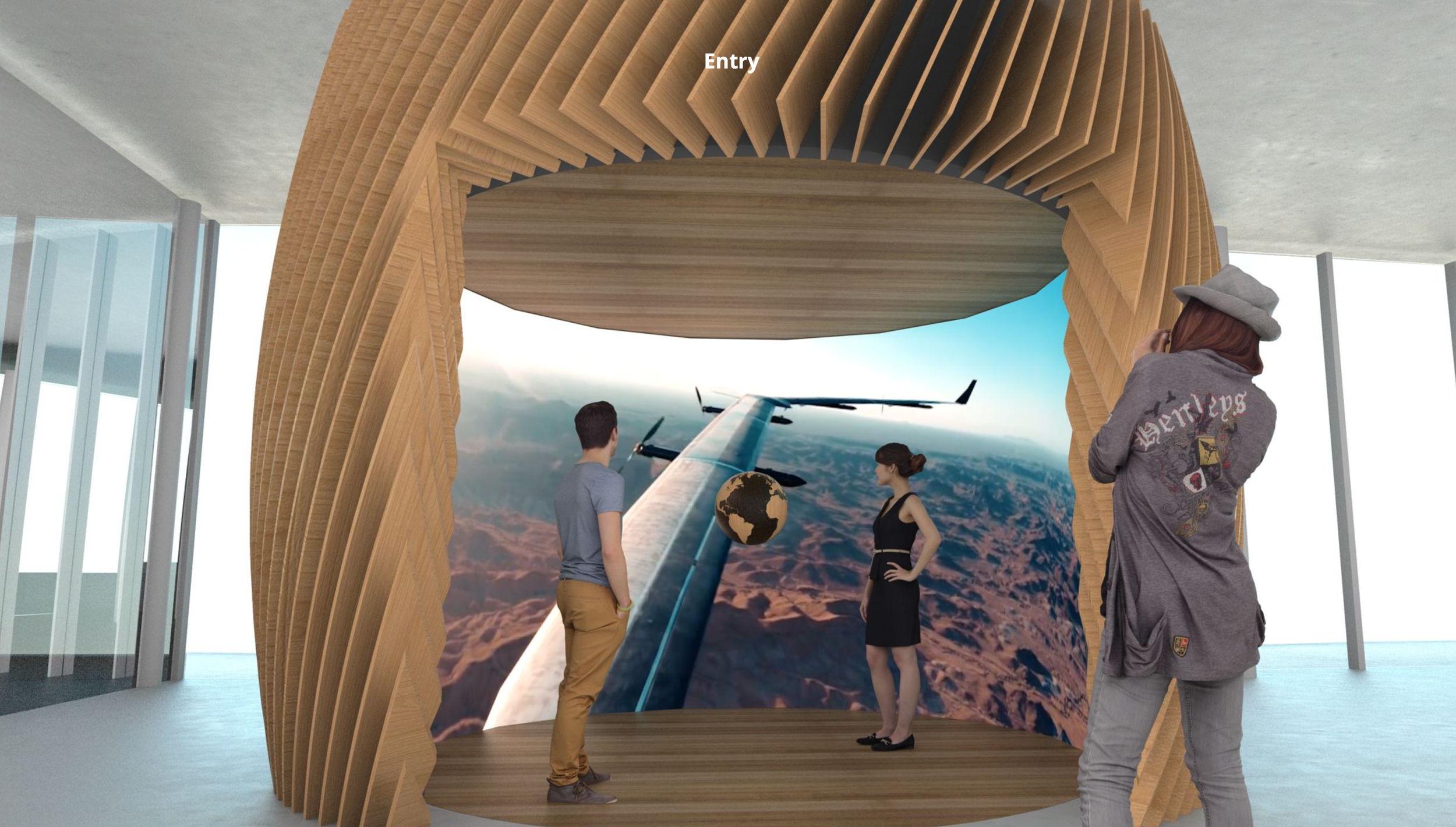
From floor plans, building materials, UI interactivity, UX and the human connection, and what all of it means in relation to the overarching brand; we collectively thought, and at times over-thought how Facebook and it’s brands could show up as if they were less digital products and more tangible, physical places. We referenced the previous partner center experience, an interactive digital wall that housed multiple experiences in one space. It’s impressive, but fails to engage over time because of too many interactions and stories that are complicated being placed into one space.
Task at hand: How to tell each product story to a group of people who may not have prior knowledge of Facebook or its products. How they work, how they work for businesses, and how do we express all of this simply while creating a system that ignores way-finding but flows organically.
The biggest question is for YOU, the viewer here, how deep do you want to go? And where do you want to start? The beauty of these exhibits is that you can start anywhere and still be able to create a singular story. Although we did have a preference on where the journey should begin.
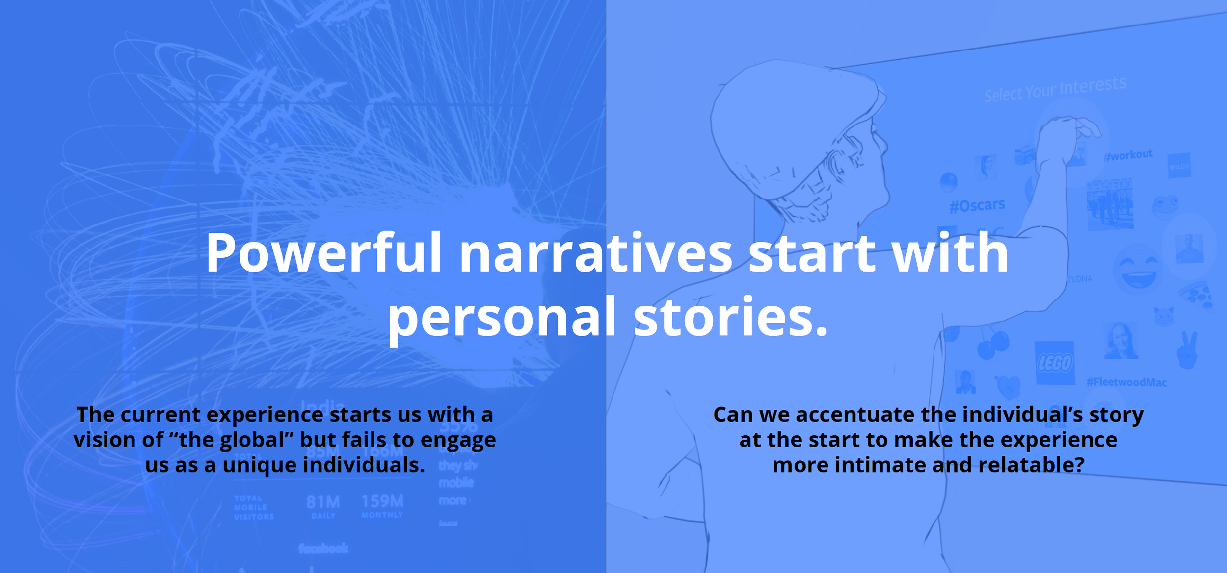


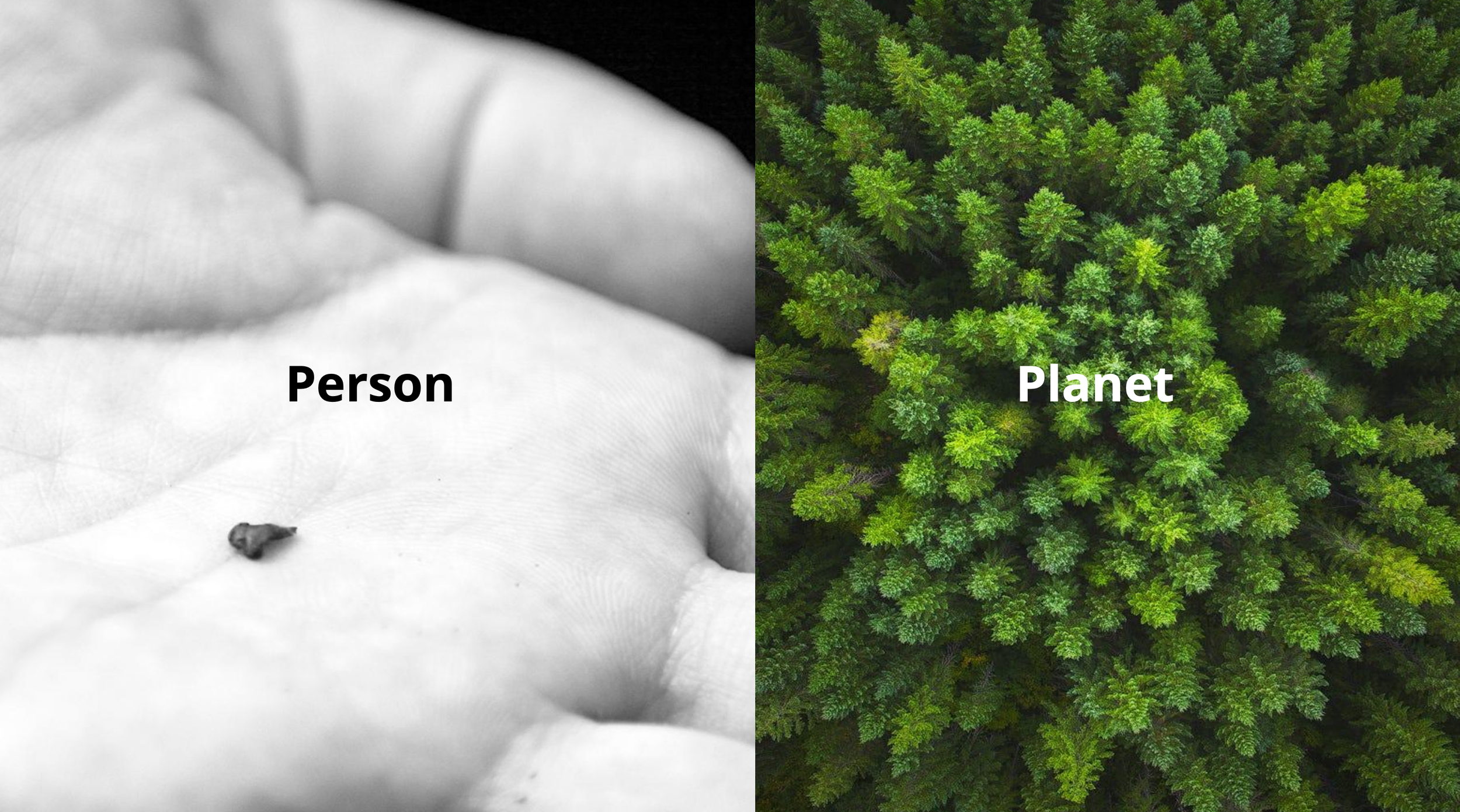
Ideally the story starts the moment you walk into the partner center floor on the roof of the building. Entering from the elevator people are greeted with a small welcome screen amidst installation artwork that strategically features arrow-like structures on the walls and positioning the lighting above to point the way forward. It’s not hidden, but it’s not blatantly obvious either. The thinking in this was to let people find their own way much like they do across the platforms. There’s an ideal way forward while also having no wrong answers.

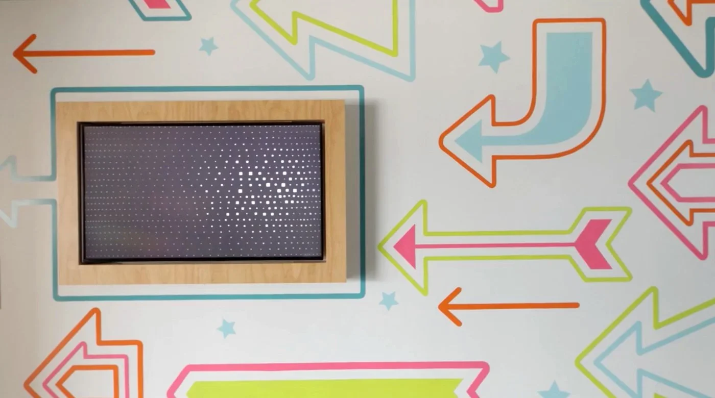
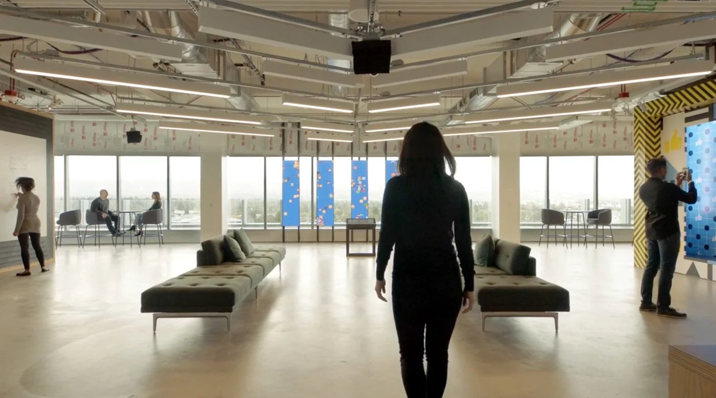
EXHIBIT THINKING
Each exhibit was a different project within the overarching project. Rather than take you through each individual exhibit, I’ll just walk through the largest and most complex one, “The Globe.”
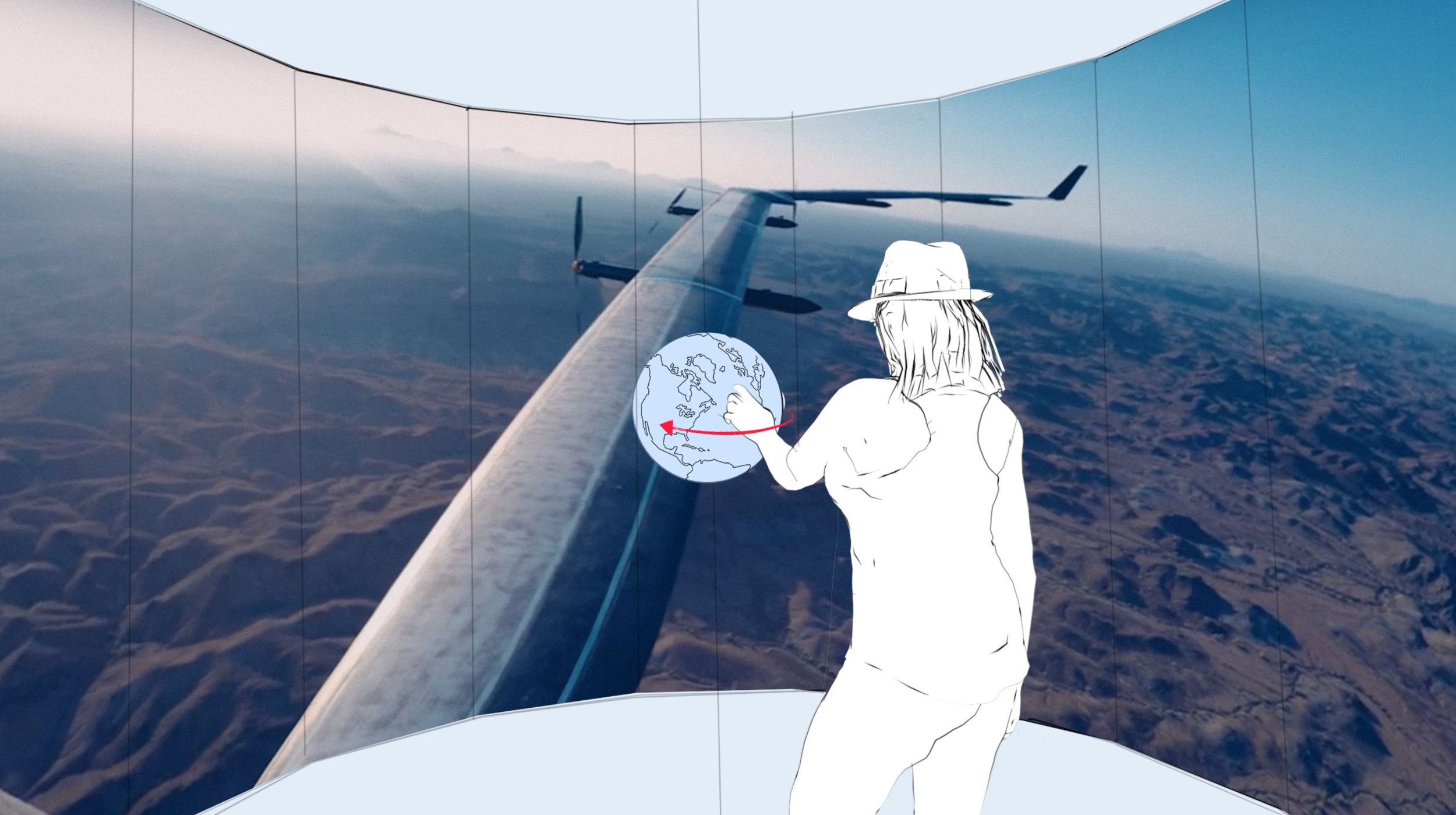
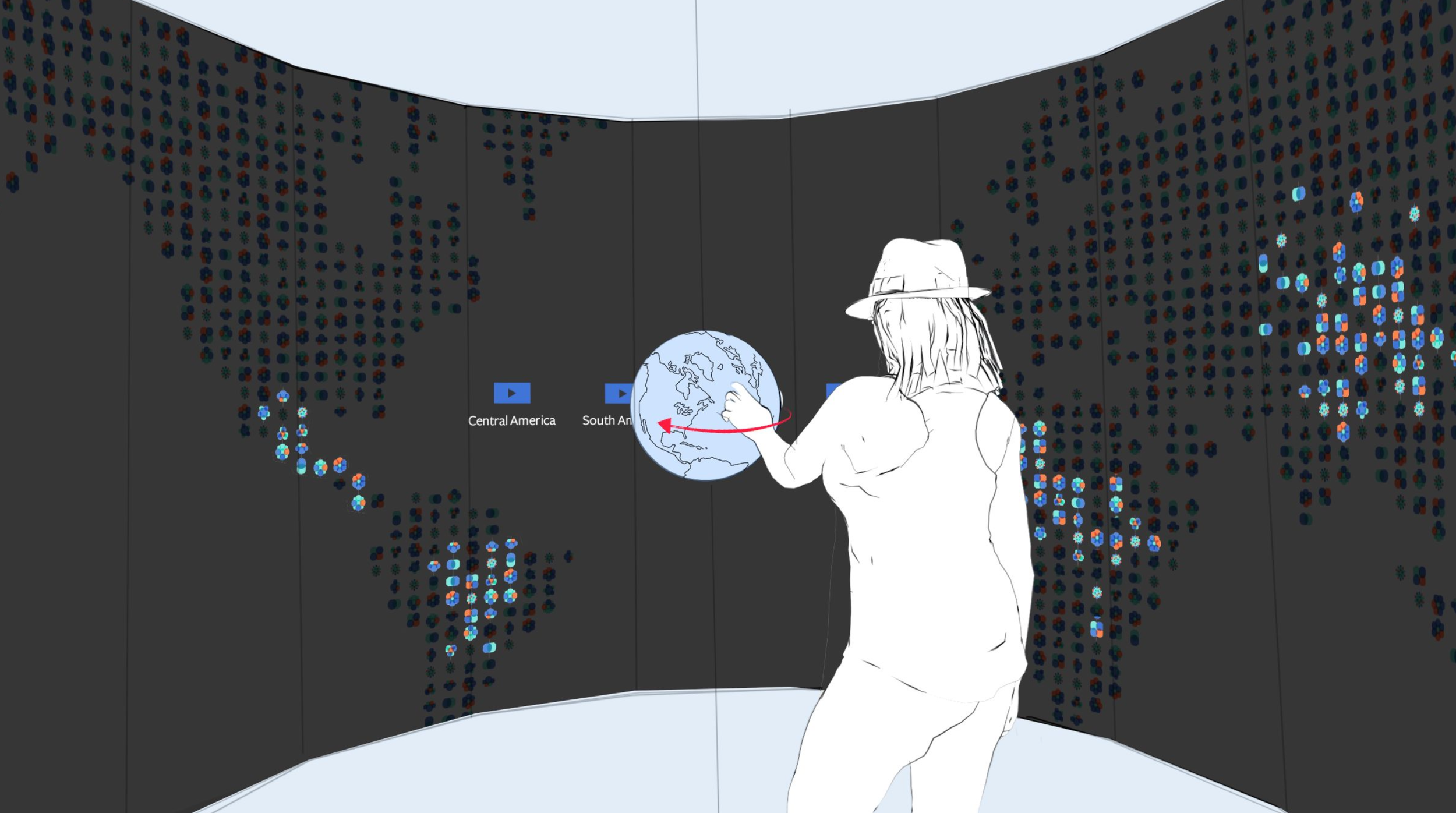
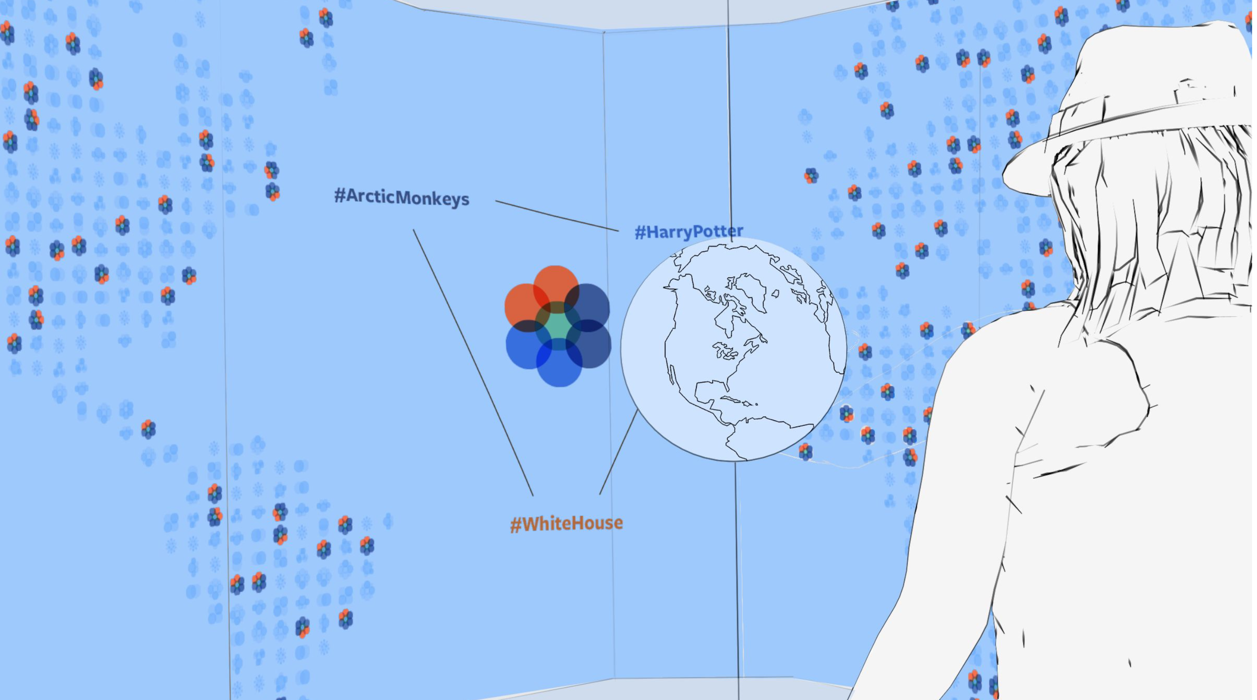
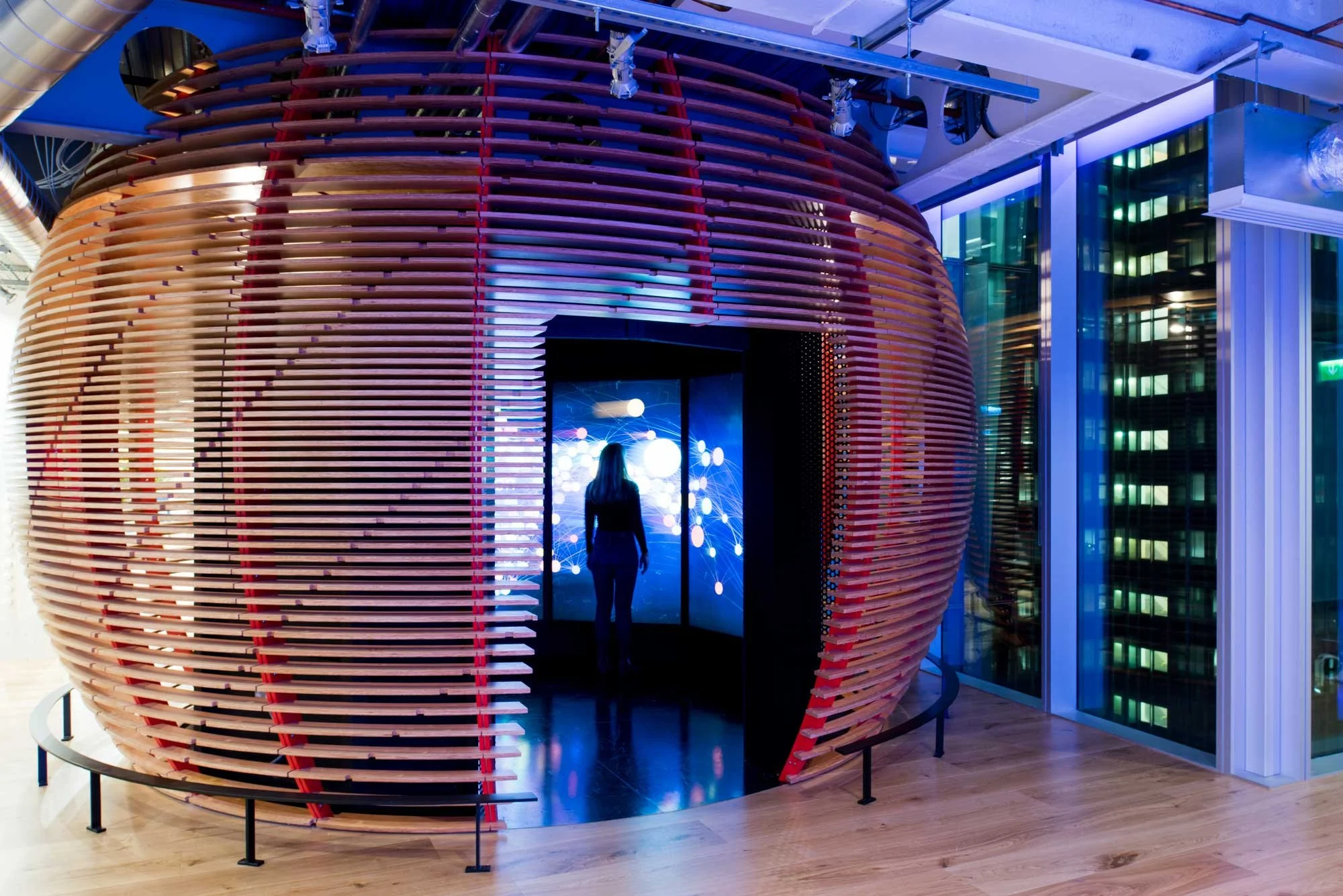
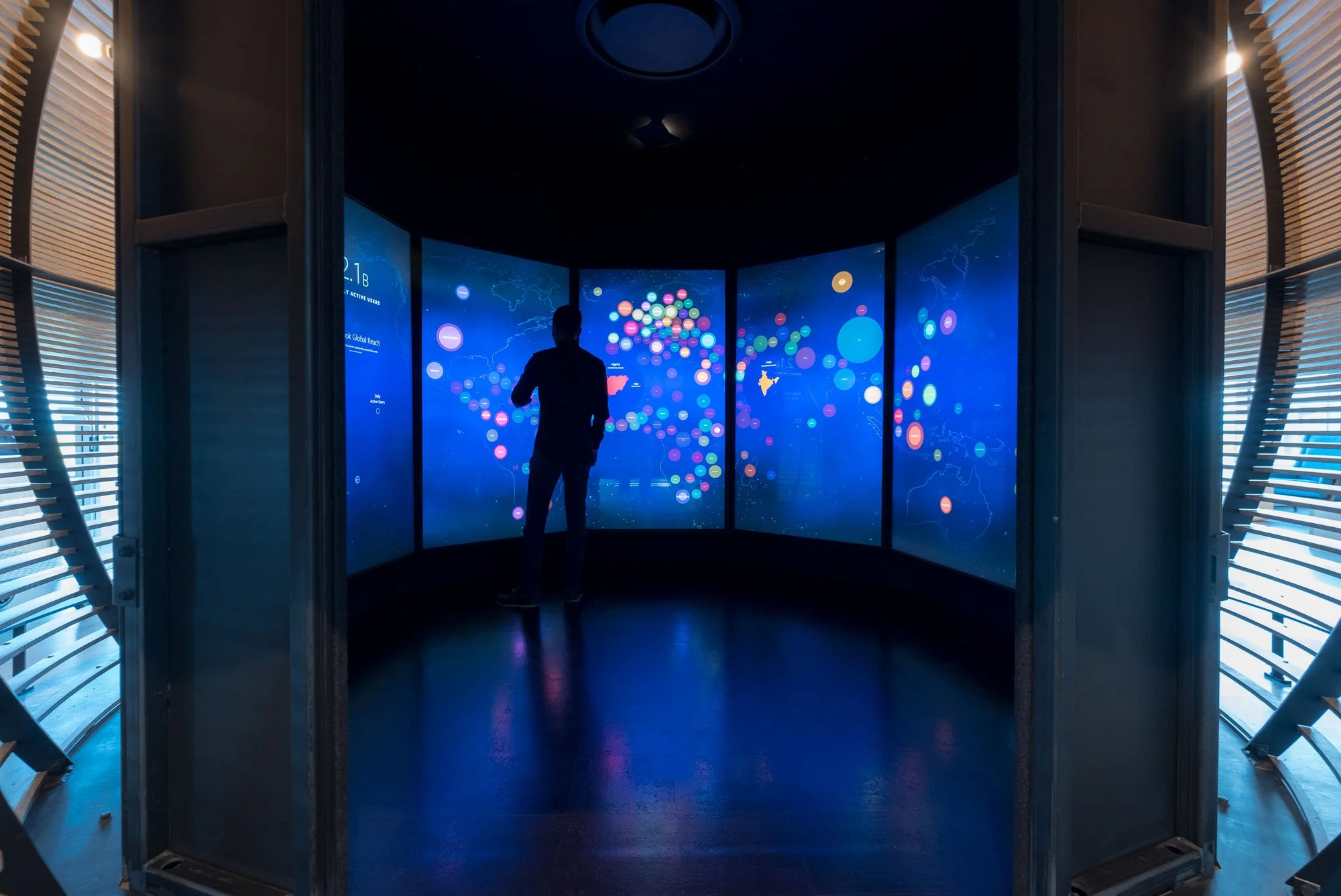
What does 1.8 billion people connecting feel like? This panoramic, geography-driven experience expresses the billions of Facebook users across the planet. By interacting with a physical globe, partners see how their own interests can quickly create relationships between the global and the specific.
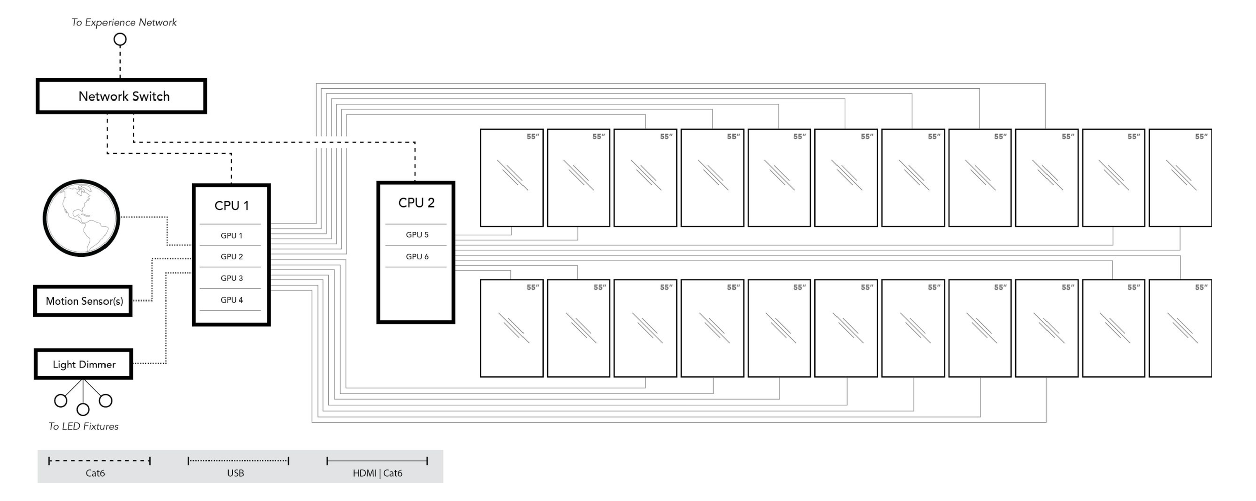
We needed a scalable center-piece that could support a wide range of content and data while maintaining a streamlined experience that didn’t deviate or create an additional one. We also wanted to fit more than one person inside the space, up to 5, that could interact with the globe simultaneously. This nuance was important in order to fully immerse people in the feeling that they are not alone and would require a control hub that synced screens, captured laser focused motion near the screen, and allowed us to control the content as much as possible.
STEP 1:
Connecting with Facebook’s public data through the head engineering team next to Mark Z.
STEP 2:
Searching the data and connecting it to the moments we wanted to highlight. This was important in helping myself and the team to ideate on data visualizations and levels of interactivity.
STEP 3:
Developing the visual wrapper that expresses the data, the motion principles, and the device that connects them all together that make it interesting and fun.
ASSETS & DEVELOPMENT
As we began collecting assets, both branded and inspiring, we began to realize a few things:
A 360 walk-in experience was impossible without stairs or an enclosure.
We would need to re-think how many screens are actually necessary and the size of them.
Materials would need to be locally sourced in order to keep costs down.
Graphics and motion had to be simple in order to avoid disorientation and potential motion sickness.
To our own surprise the majority of flows and visual narratives came about fairly quickly due to the stellar brand guides and assets I had put together with my team on the B2B teams. We had motion principles, graphic assets, and plenty of partner stories to pull from which helped us move forward and gain approvals quickly.
MY ROLE
The most important thing I did here was to facilitate partnerships and conversations between the agency design teams and the lead engineering teams at Facebook. I then created and provided sketches, design assets, motion principles, and Facebook data narratives to develop the backbone of the Globe exhibit’s interactions. While working closely with creative directors at HUSH studios in NYC we were able to craft narratives, solve for visual disparities as well as the motion sickness problems, and source local materials for the construction in each region that the exhibit would be built in: Menlo Park, Singapore, London, Dublin, Tel Aviv, New York, and São Paulo.
Through my partnership with the director of the partner center and the director of the global standards team we defined the Globe’s story for Facebook’s C-Suite, highlighted how it works, the data it pulls from, and obtained clearance from legal teams to publicly show all data stories in the exhibit without compromising otherwise private, personal, or confidential materials.
Budgets were thankfully handled completely by the global standards team. This allowed me to do what I do best: Design, provide direction, adapt to any changes in budget and objectives, and facilitate collaboration between otherwise disparate teams.
THE GLOBE DEMO
OUTCOME
In the end we scaled back from the initial plan of a 360º floor to ceiling walkable experience and into a 240º 55 inch tall walkable experience that is as equally delightful and less stressful on the viewer, literally. We also had to remove the idea of a physical device that controlled the interaction and instead let the person be the device through a simpler touch interactivity. The technical requirements were more complex but the physical space was simplified.
Each hurdle we encountered, from either budget or technical feasibility created a richer experience that was both more grounded and helped us, the team, to tell a much more human story.
A flexible, modular system was created that allowed data stories to be swapped out along with any changes to motion, colors, shapes, fonts, and scale. This thinking allowed future teams to continue using the space, structure, and experience in nearly any way imaginable.
The new partner center


THE BRANDING
Based on graphic elements found throughout the company campuses and of course the Facebook brand itself we created a sort of sub-brand exclusive to the clientele of Facebook’s creative shops and partner centers for people that would typically visit the Facebook campuses for partnerships or visiting dignitaries. From welcome elements to presentation and event collateral, we created everything that a sales team, marketing team, or event producer would need and put it into an all in one easy to reference package.


My Role: Creative Direction, Floor-planning, Concept, Design, User Experience, Data Collection
Shirley Lam: Global Standards, Building Planning, Architecture Design
HUSH Studios NY: Architecture, Development, Concept, Design, Motion, Development
Hello Design: Branding, Collateral
Length of Project:
18 Months to first build.