
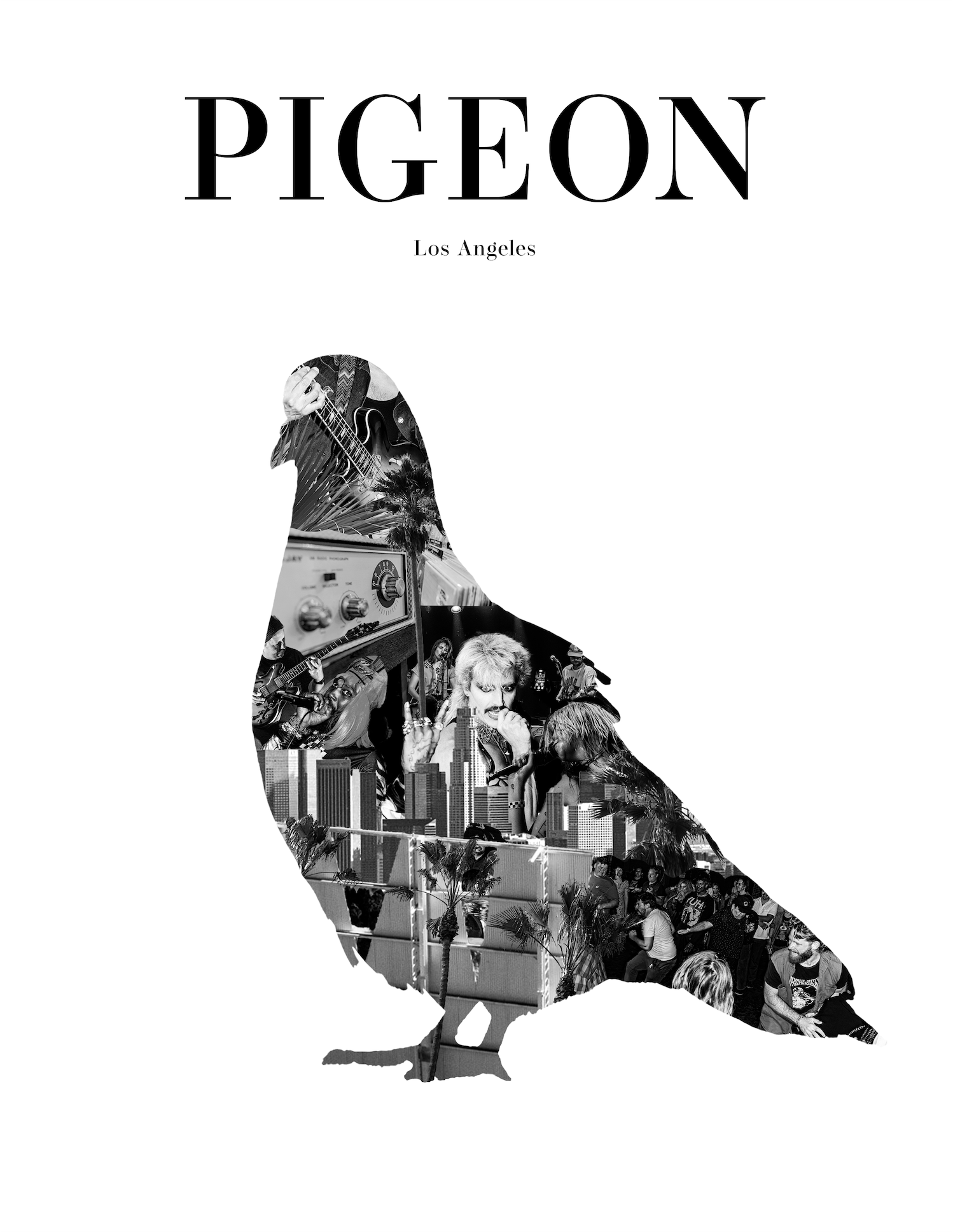
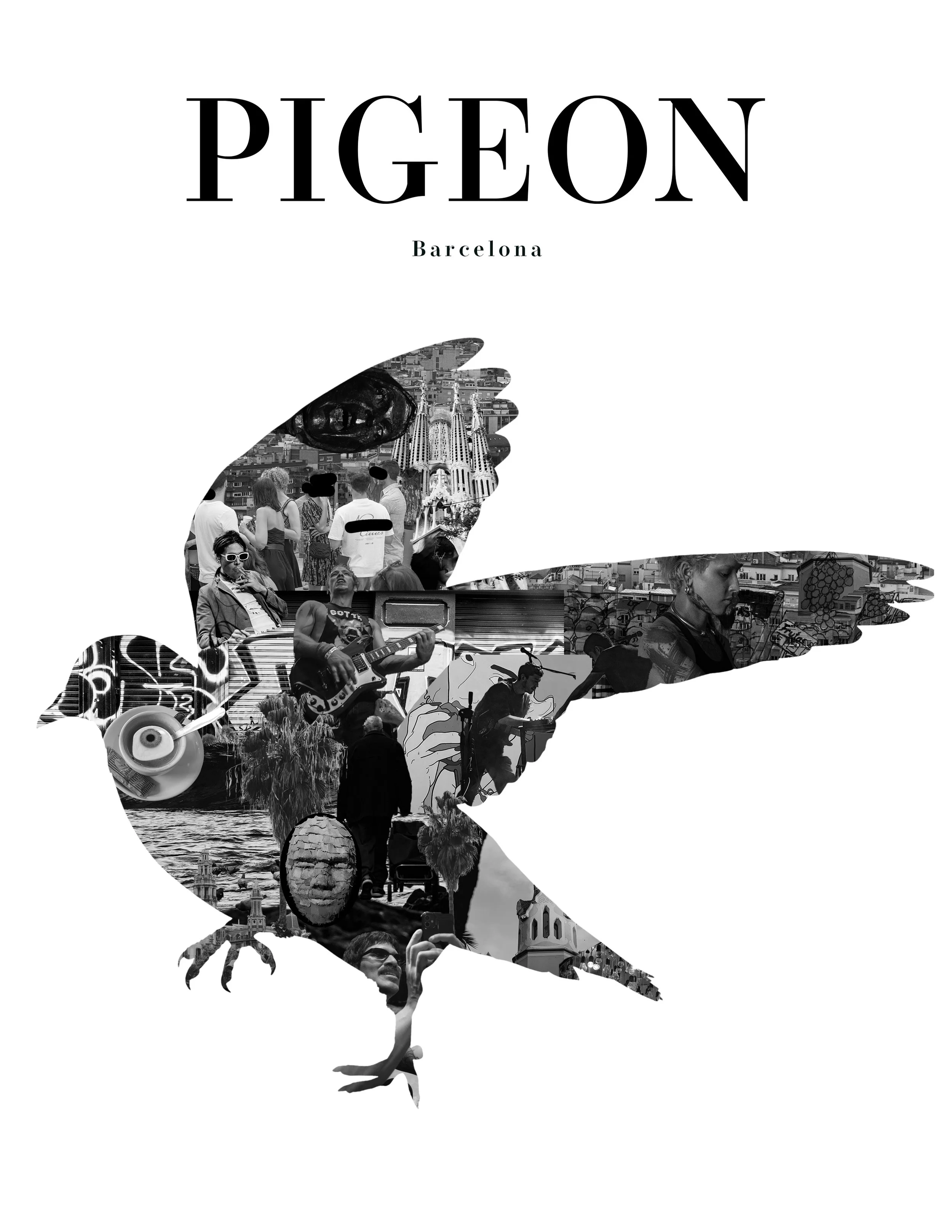
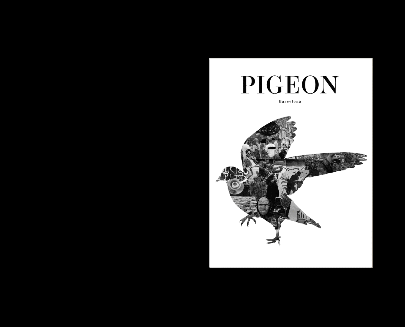
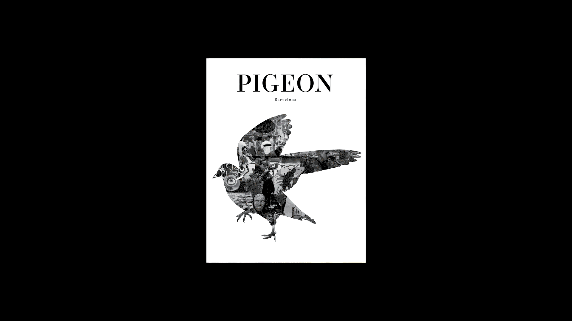
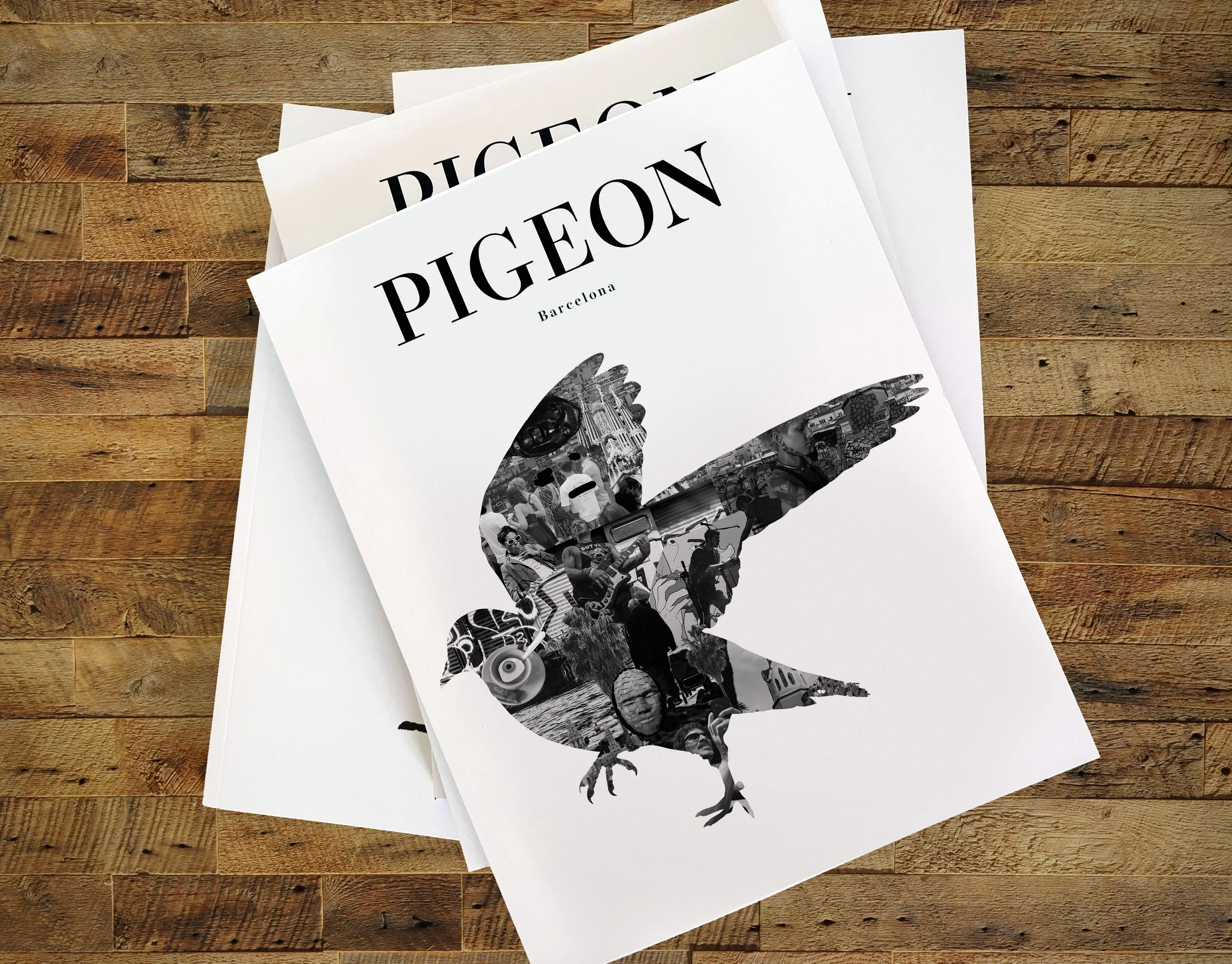
Pigeon Magazine
Building a Brand and Content Community
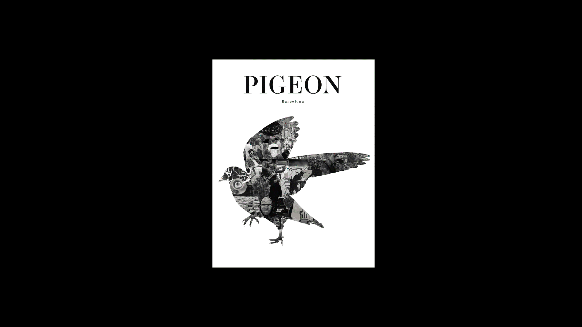
Visit the project here: www.thepigeonmag.com
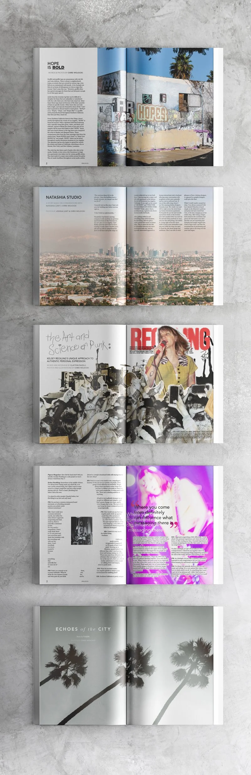
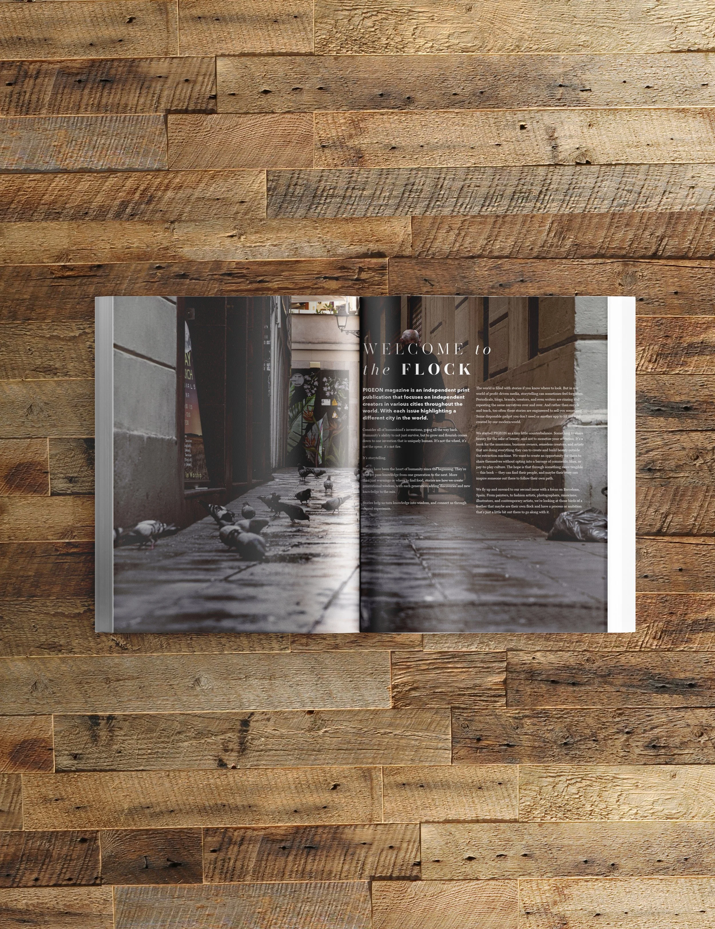
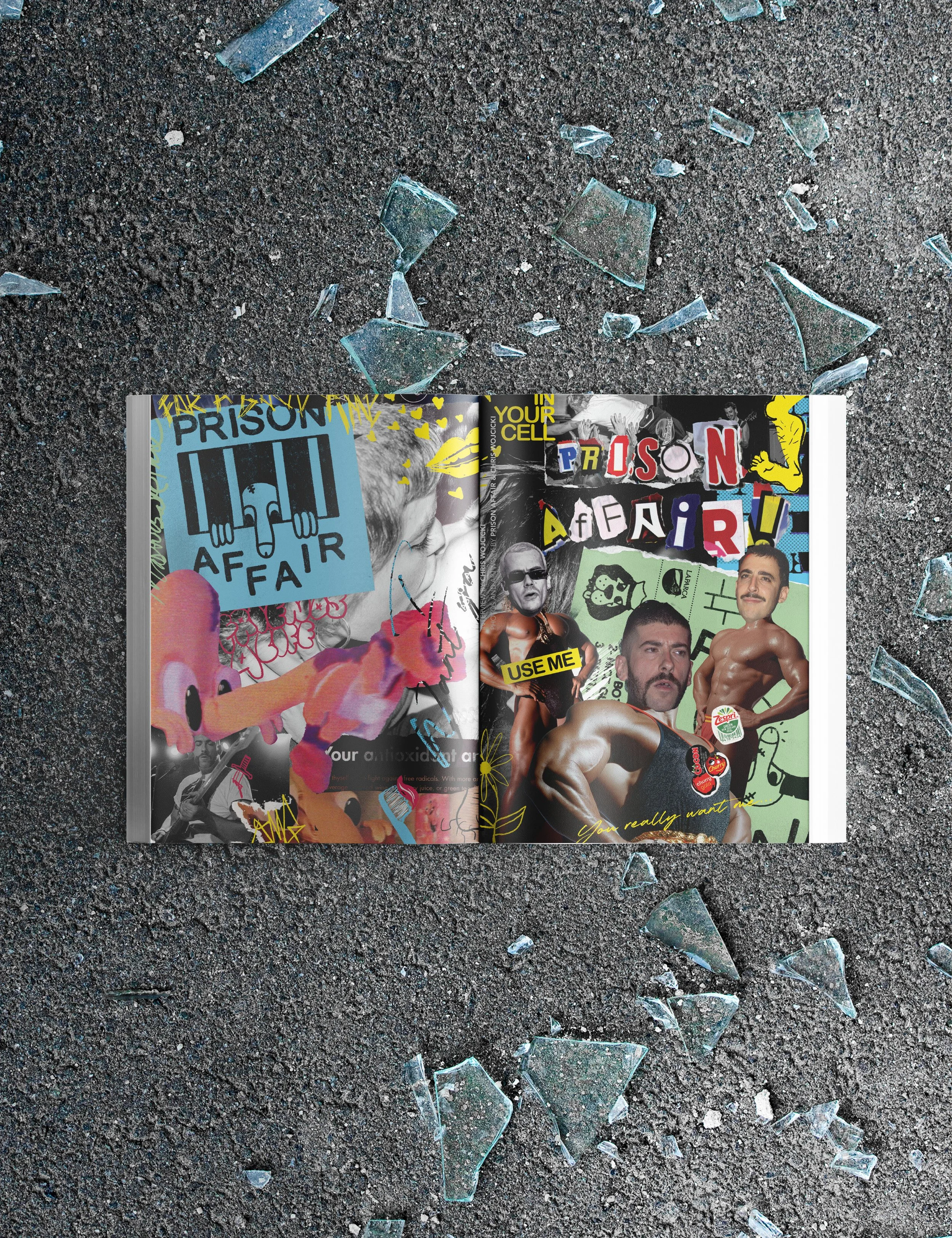
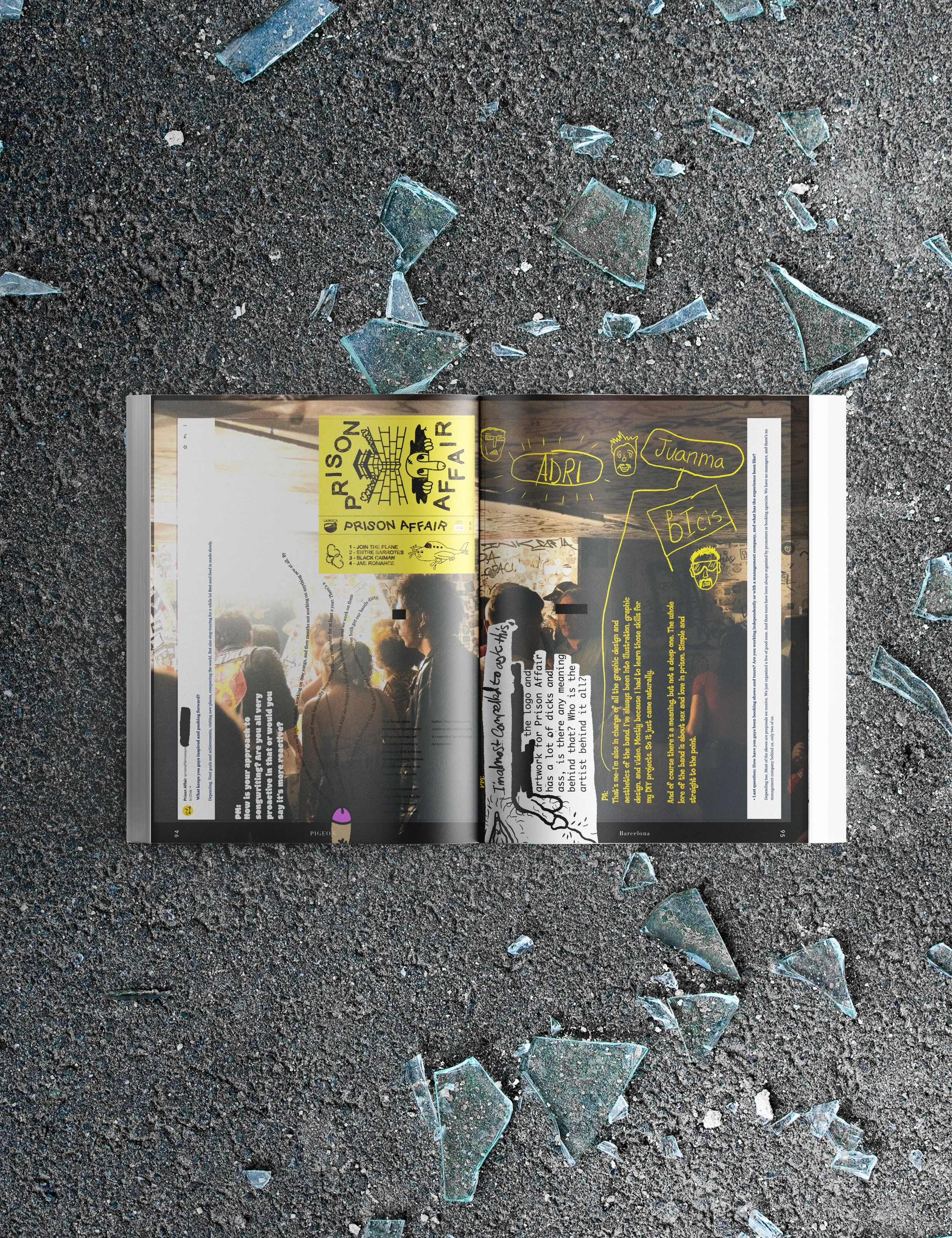
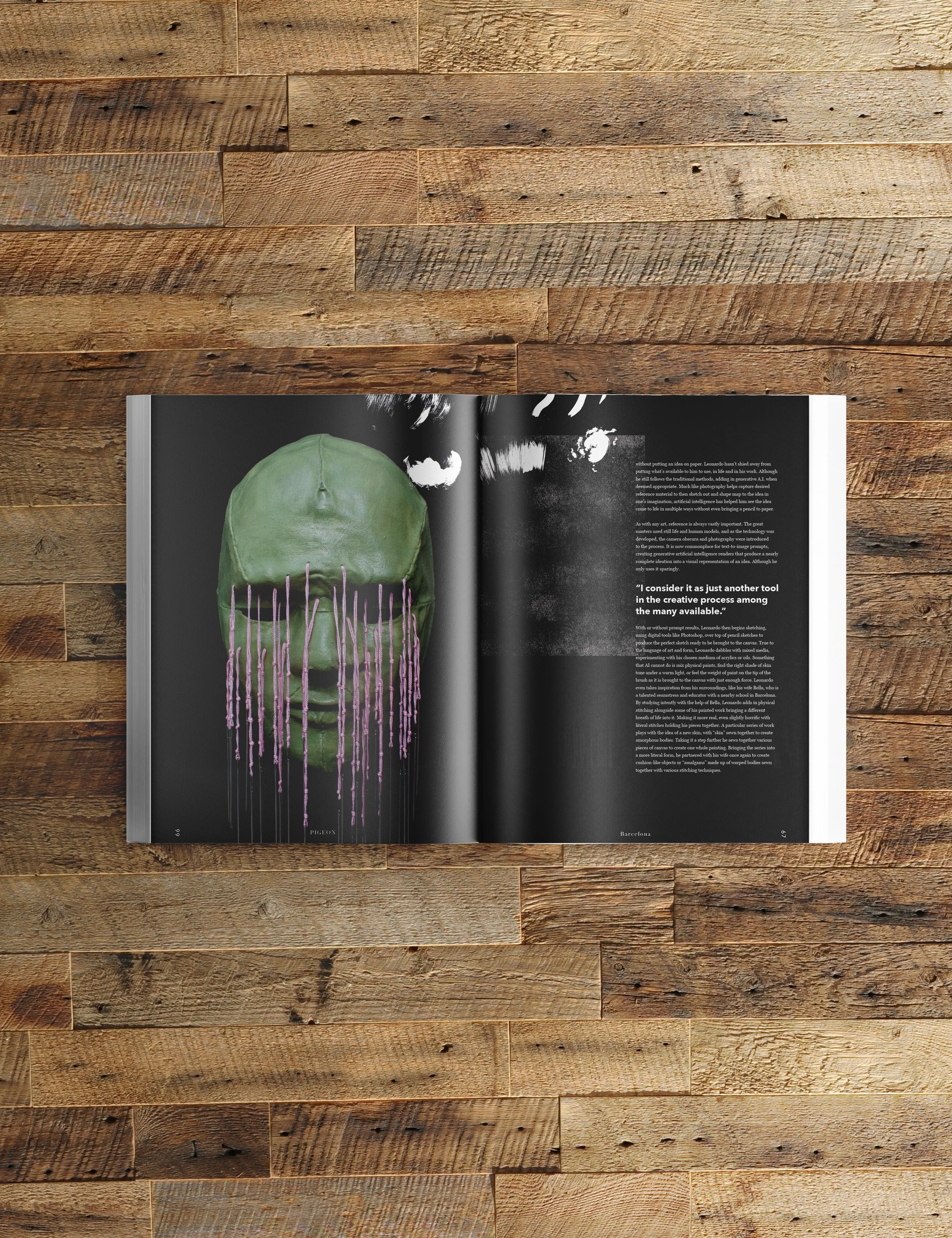
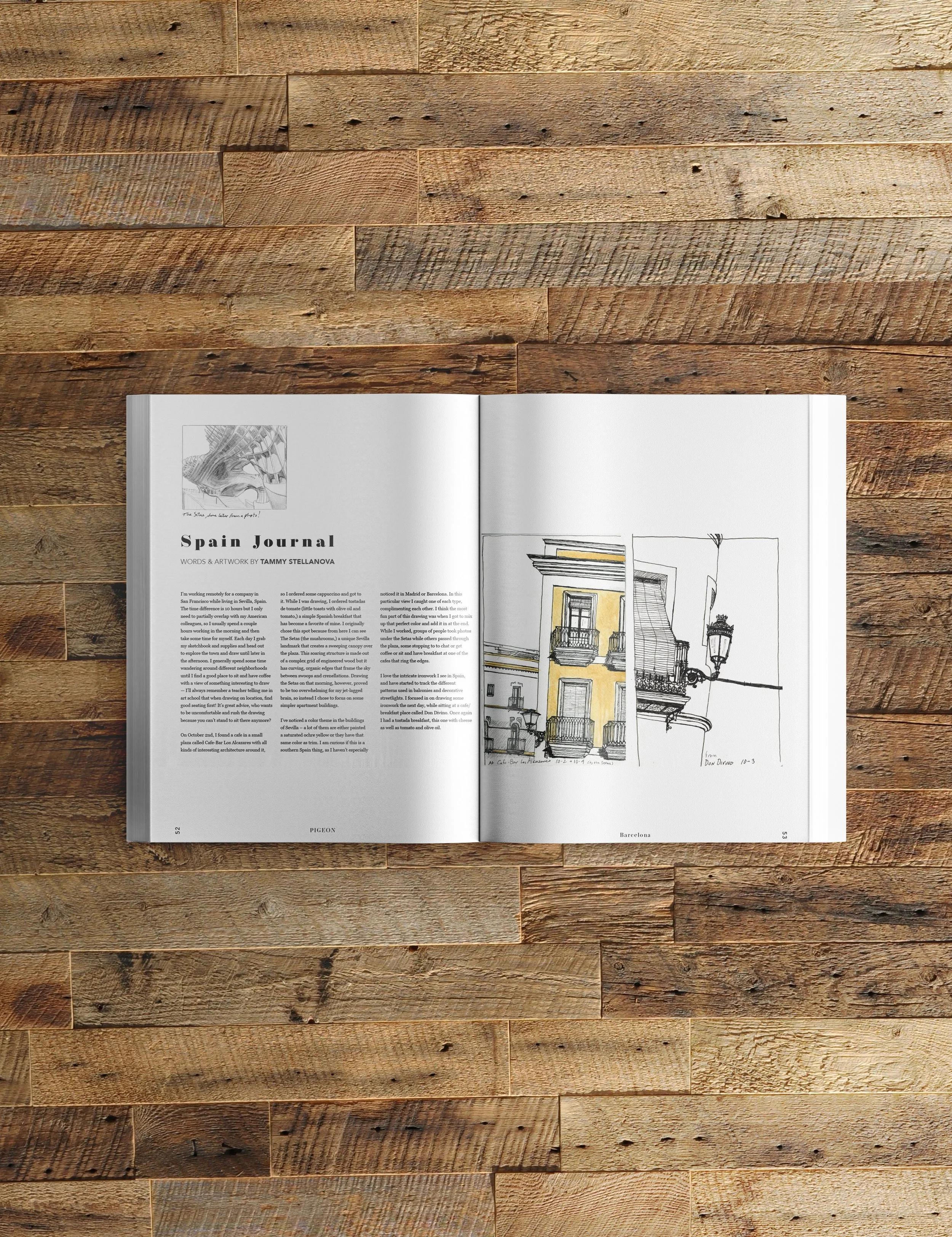
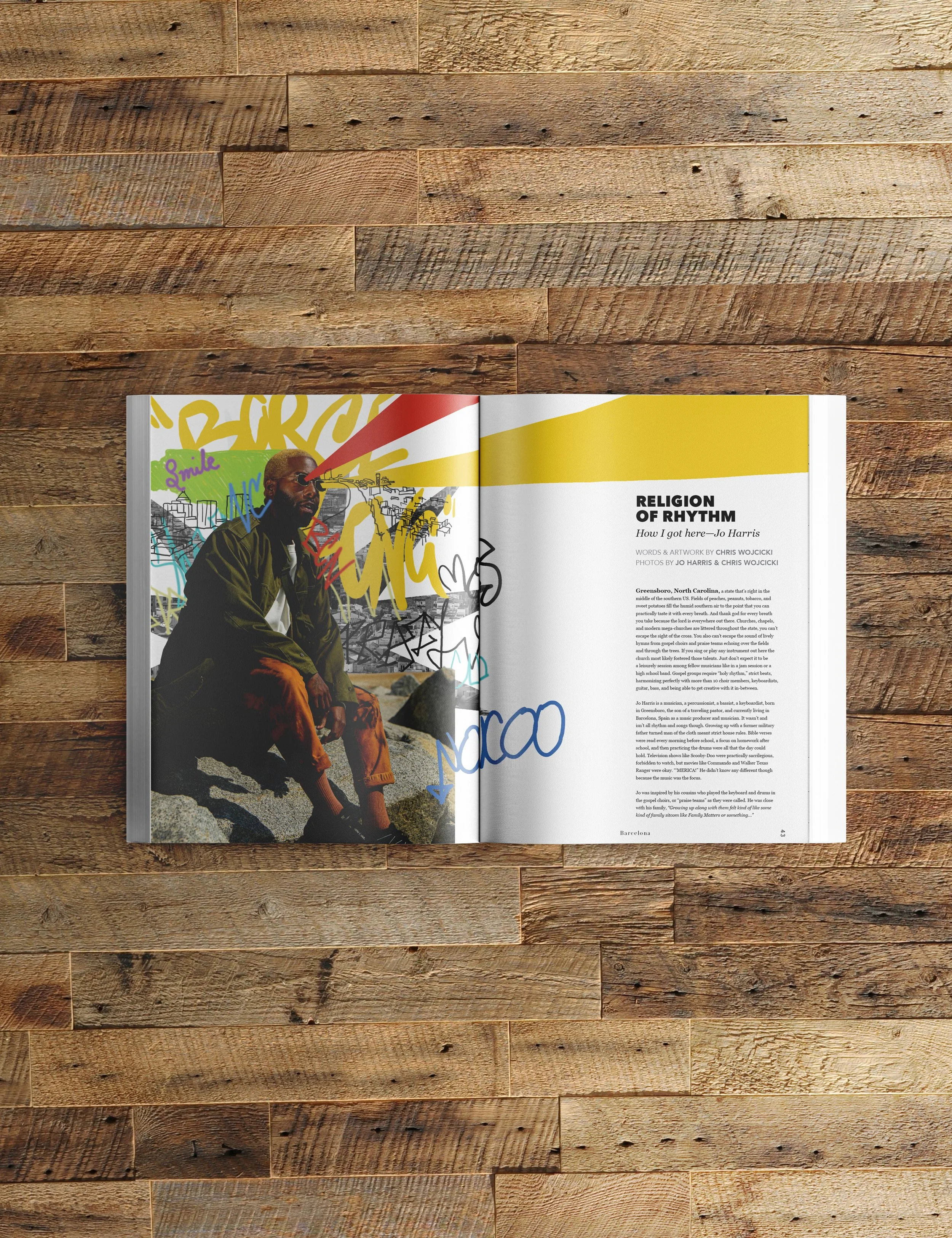
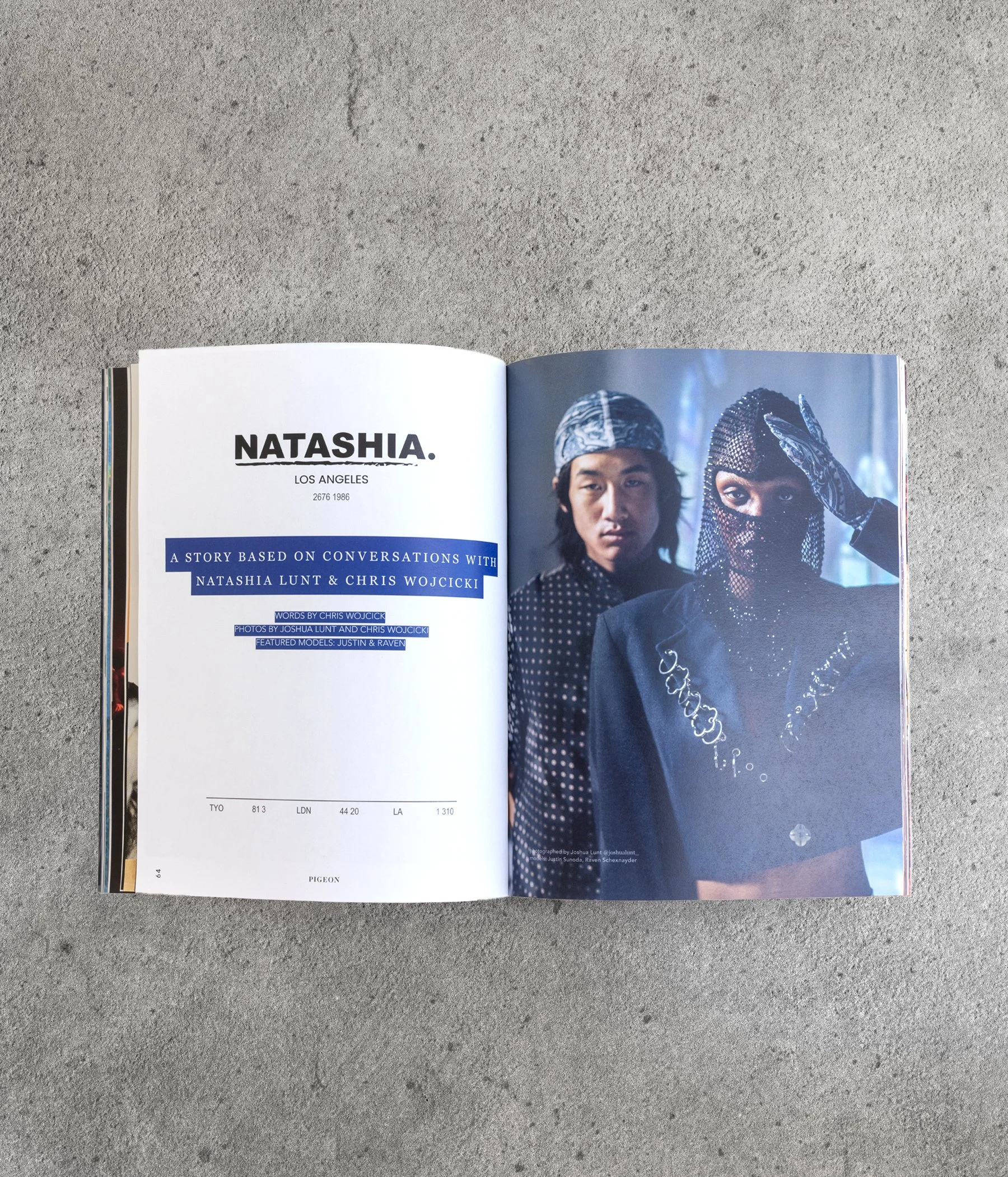
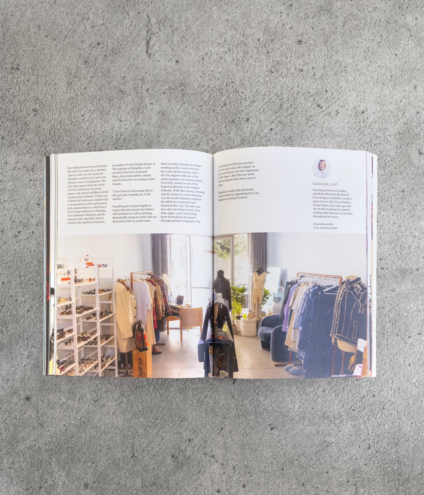
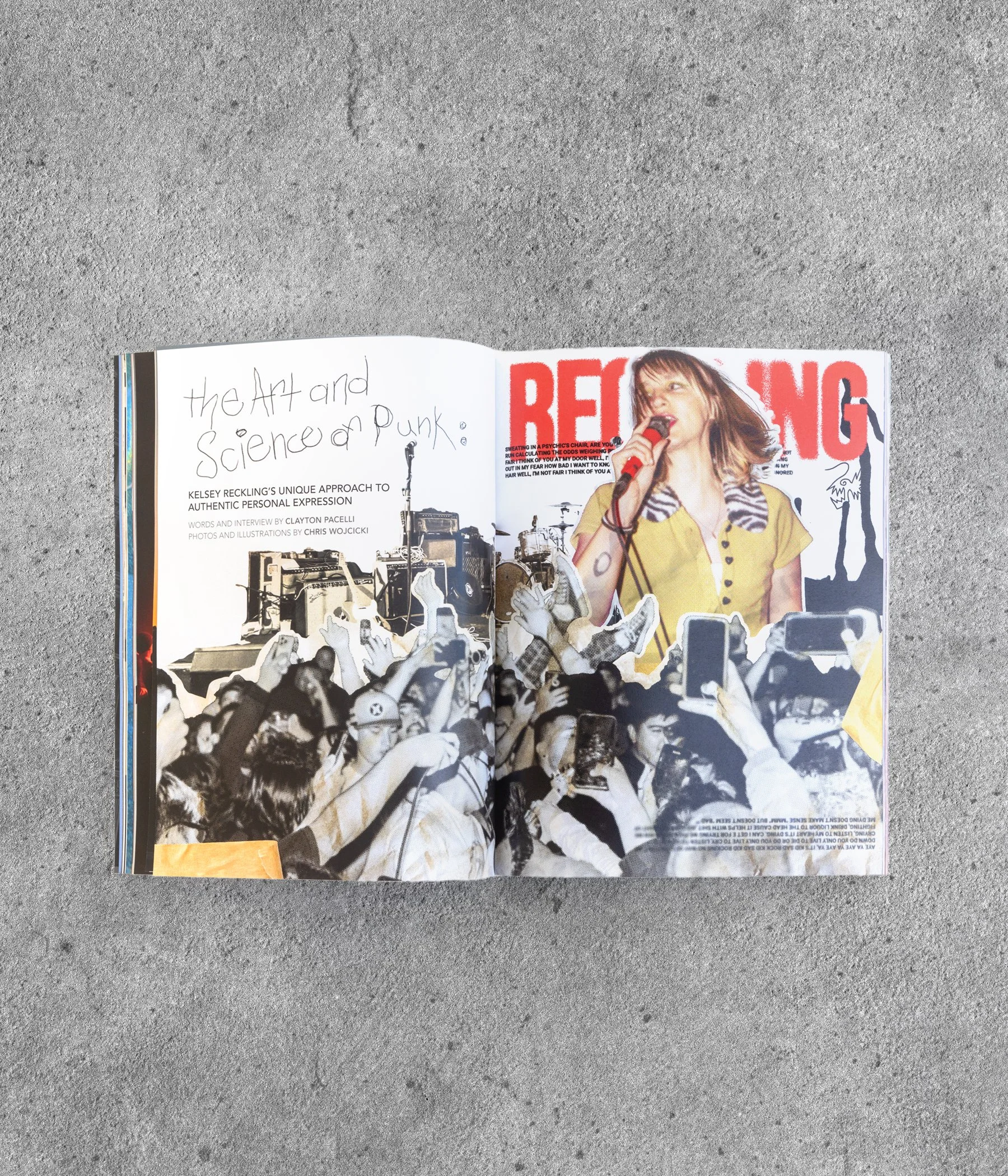
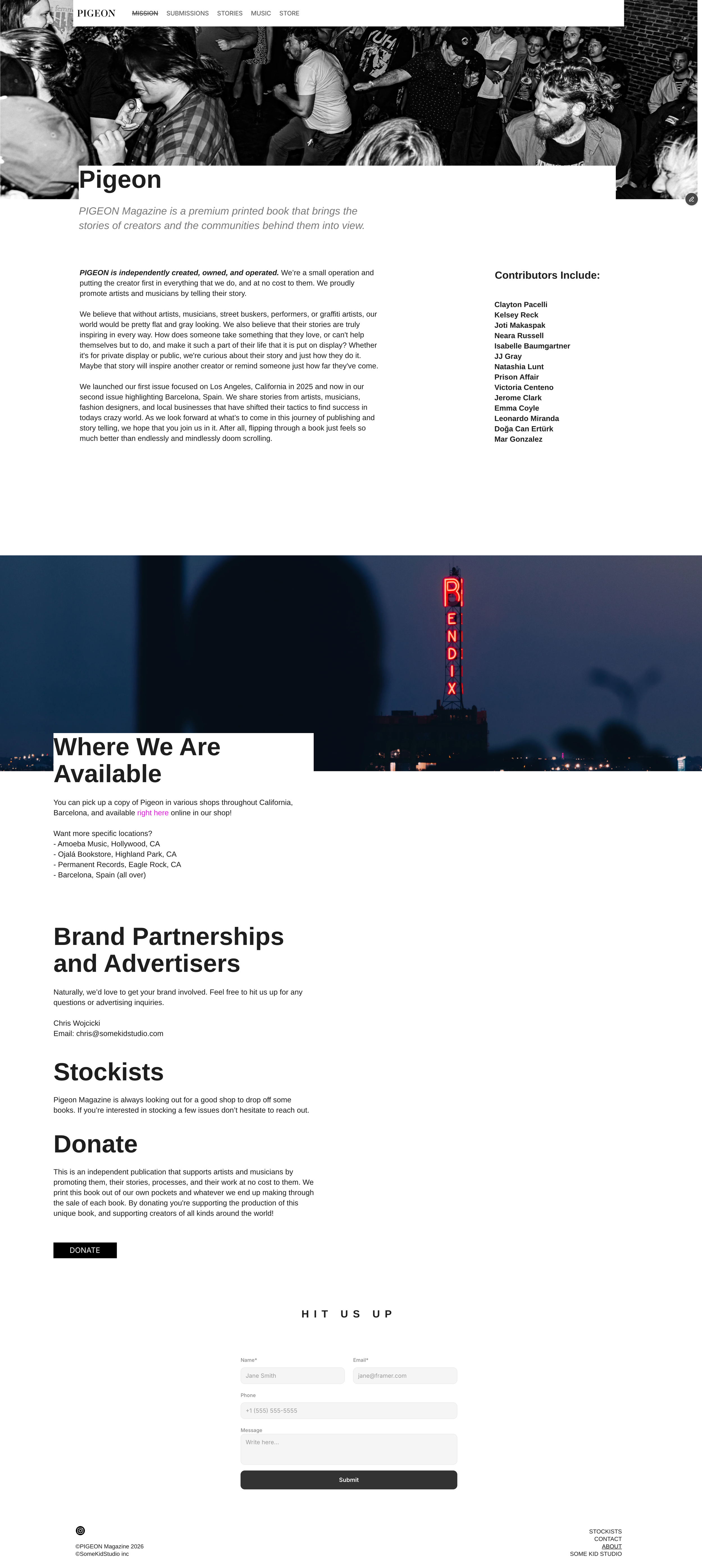
Pigeon Magazine is a self initiated project. It started as an annual premium printed publication, an art book, and has grown into an online content community. The printed book focuses on one city at a time and highlights the amazing artists within. The goal is to tell those artist’s stories, promote them, and most of all to bring attention to the actual work that it takes to create something and put it out into the world.
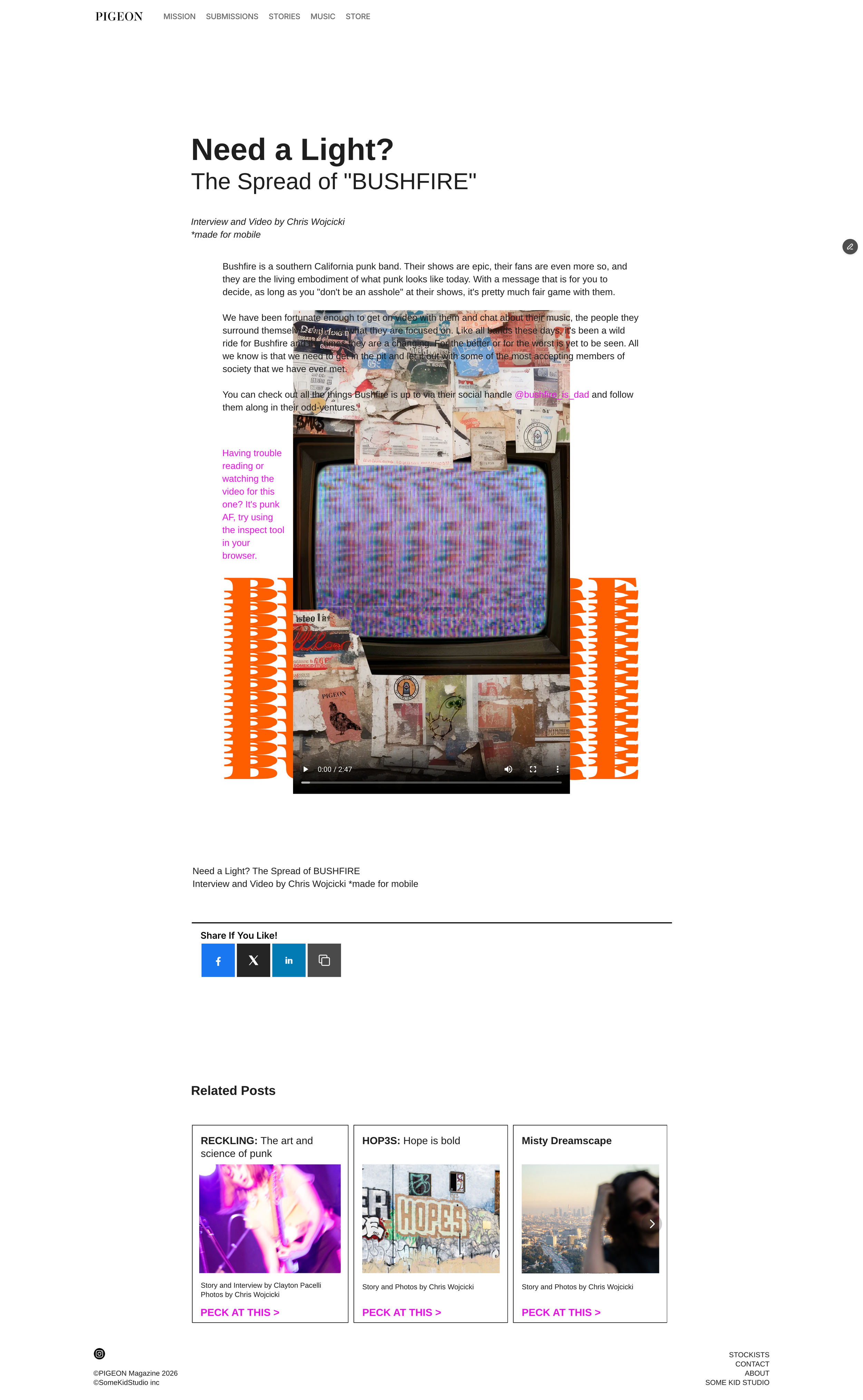
Online, Pigeon Magazine meets with artists of all walks of life from all over the world to put the word out. Creators are about creating, and this project is here to talk about just that.
THE PROBLEM
There are too many platforms that are “pay-to-play” and they ignore people that are maybe doing something unconventional, innovative, or just incredible by human standards. This is here to correct that and help promote artists as well as inspire audiences. Awards, gallery exhibitions, or other recognition doesn’t matter.
THE BRIEF
Create a community, a safe space for creators to tell their story, share their work, and invite the world into theirs. Focus on unsigned, fully independent creators, and do not use any AI tools to create. Most importantly, have fun while doing it.
INSIGHTS & LEARNINGS
The cost of print, travel, merchandise, distribution, and man hours does not equate to a profitable business without producing massive quantities. It requires more work in terms of “getting in front of people” or “educating” people” about the topics within. Finding a sponsor, advertiser, and stockist are some of the next steps.

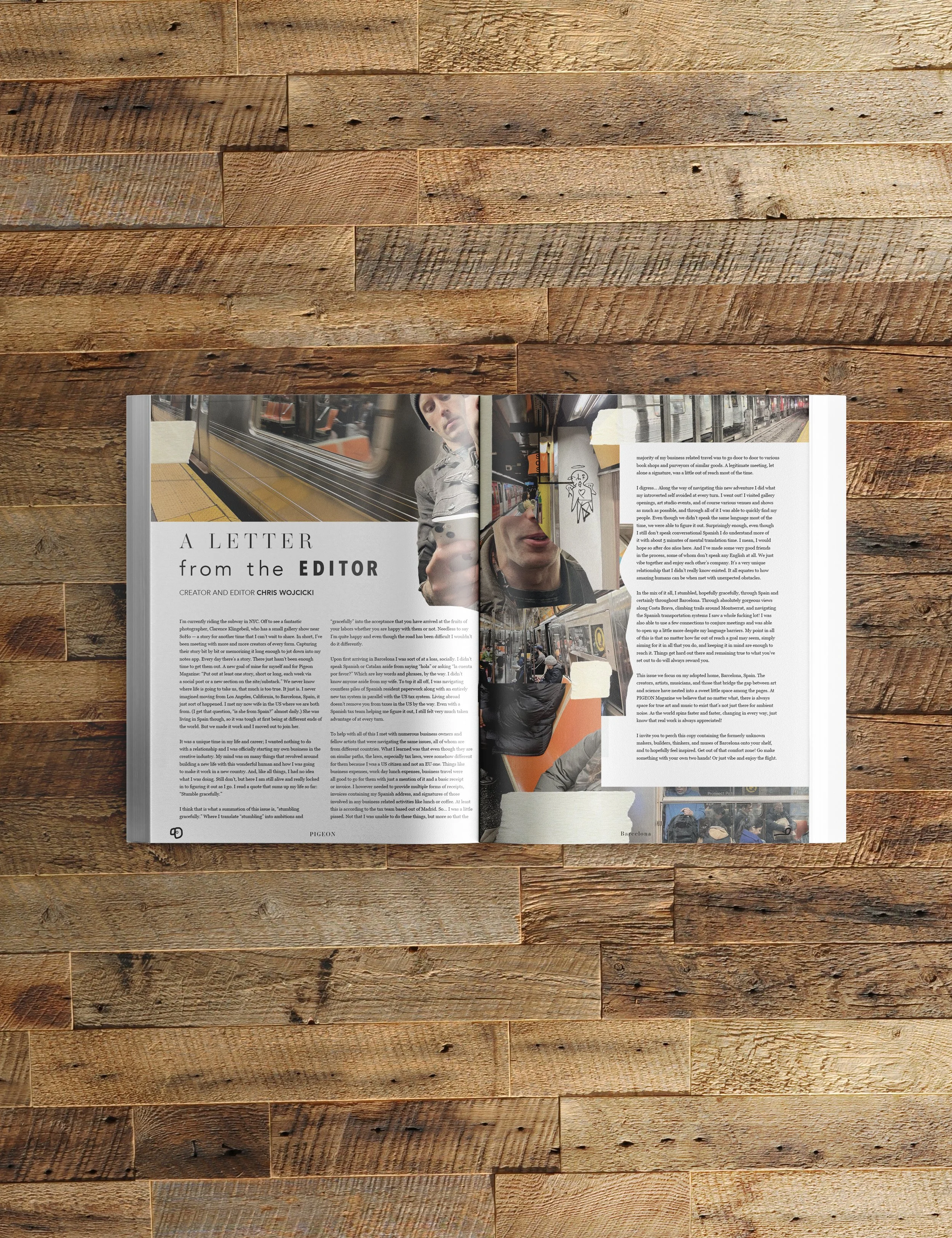

My Role: Editor, Creator, Producer, Writer, Interviewer, Designer, Photographer, Illustrator, Animator, Videographer, Motion Designer, Web Designer, Production Artist
Contributors: Countless contributors and the numbers are growing with each issue
Length of Project:
Ongoing